Cremissimo. Taking ice cream up a swirl.
Project type: Packaging Design, Tone of Voice
Unilever identified a significant opportunity in the Australian premium take-home ice cream market, specifically within the 1 litre segment. Cremissimo was quickly identified as a brand with the most resonant proposition.
The premium 1L ice cream category is a crowded, visually competitive space, where new brands need to not only look credibly premium, but outperform existing competitors in consumer testing.
The deeper challenge was creating a distinct brand personality and tone of voice, translated into packaging that communicates quickly, clearly, and compellingly at point of sale, where attention is brief and the competition is immediate.
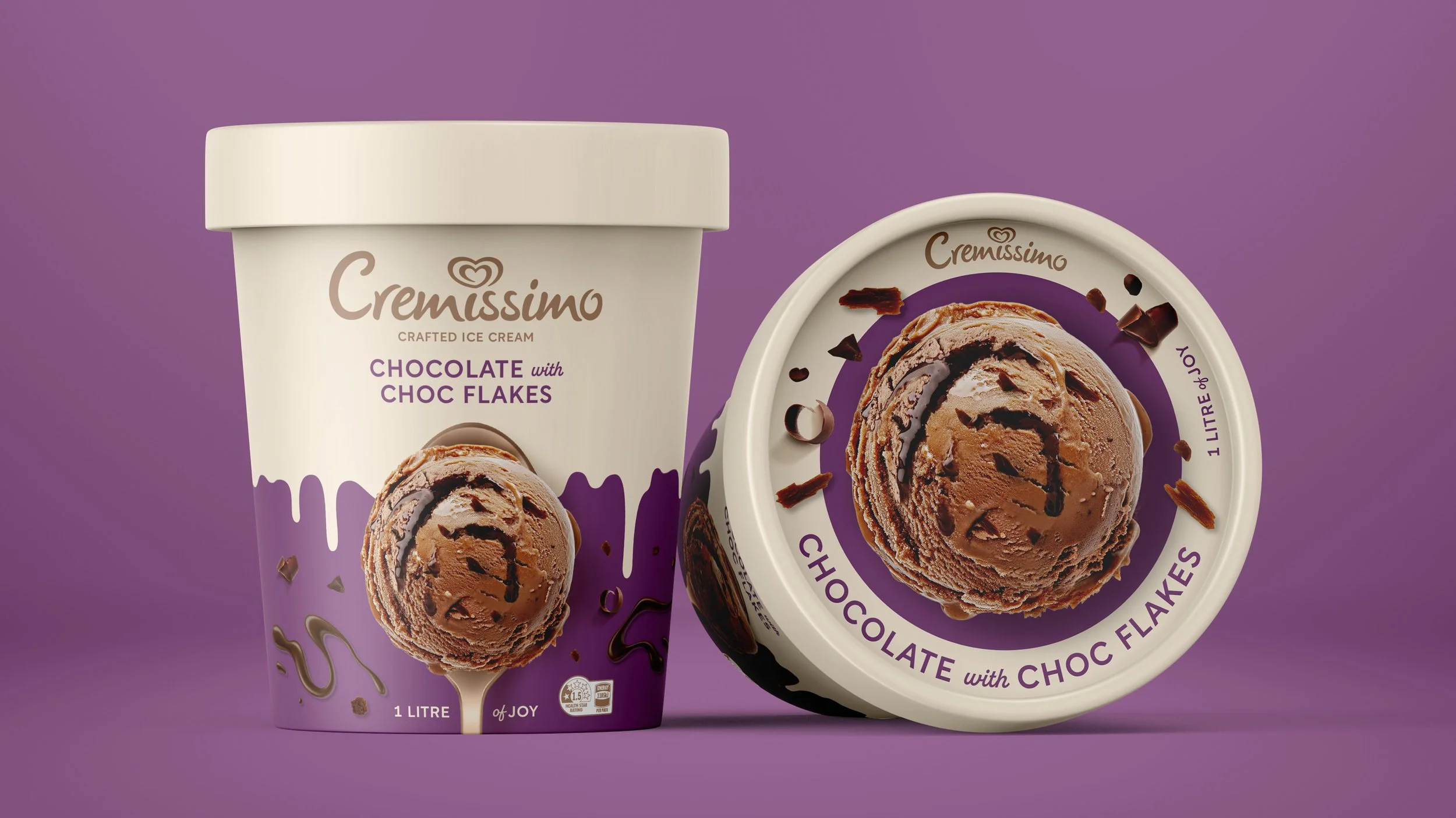
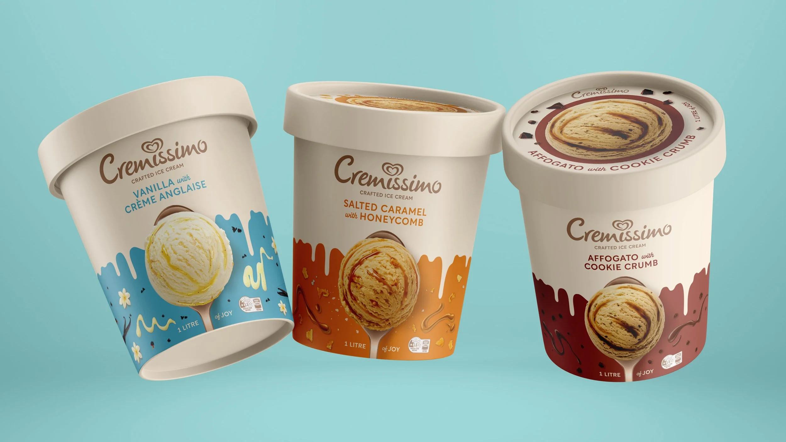
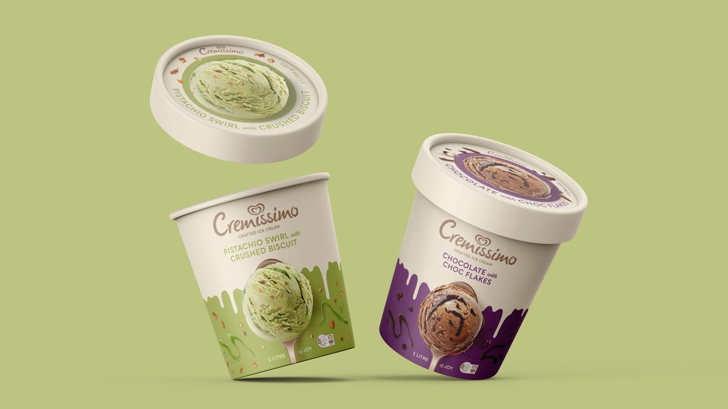
To cut through the clutter and capture the brief window of consumer attention, the solution was to design Cremissimo with a clear creative focus - saucy creaminess. Each tantalising flavour comes to life on a spoon, bridging experience gap from shelf to mouth.
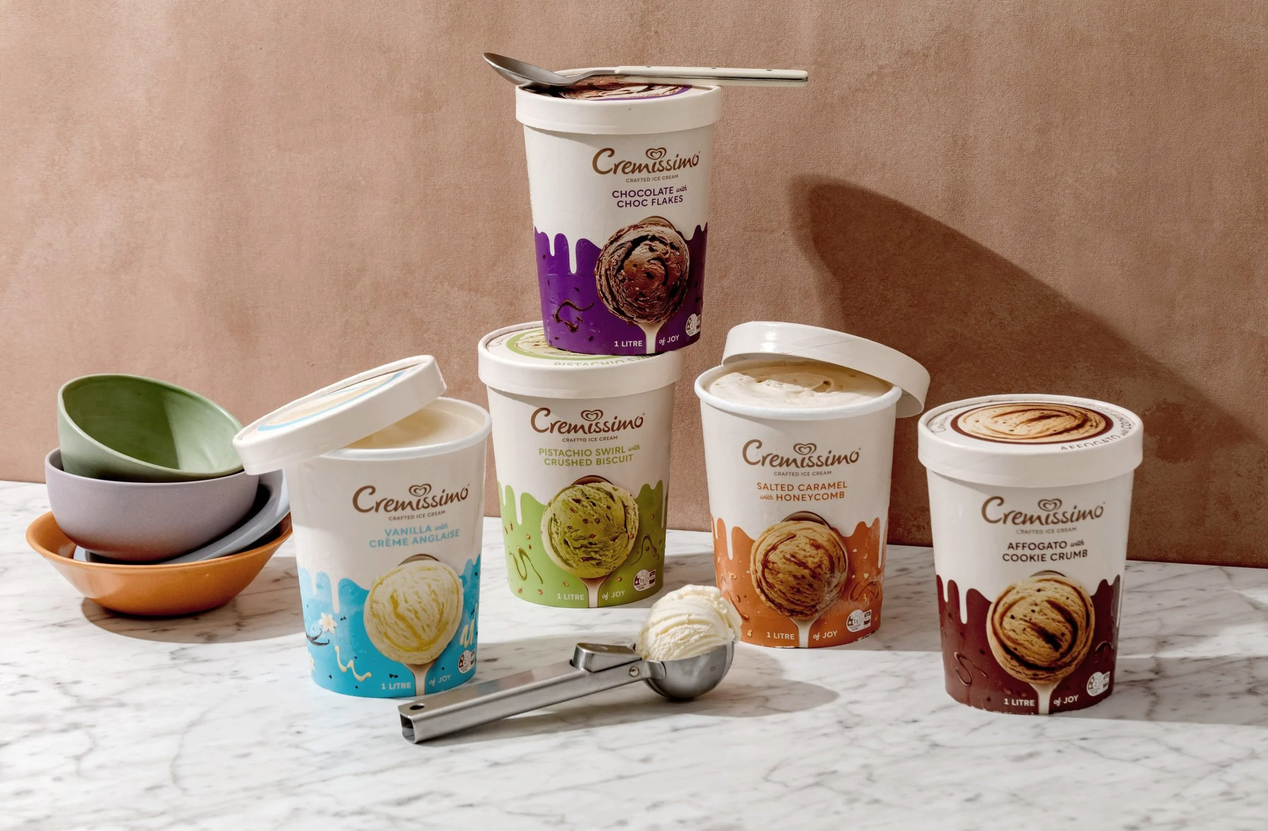
Premium cues drew inspiration from across ice cream and adjacent categories including beauty and lifestyle, where restraint, material quality, and typographic confidence signal premium without noise. A bold colour segmentation system was introduced across the flavour range, giving each variant its own distinct identity while maintaining cohesion as a family on shelf.
The result is a range that reads as premium, flavour-forward, and unmistakably Cremissimo.
Agency & role:
Creative Director at Cowan Asia Pacific
Client:
Unilever Australia